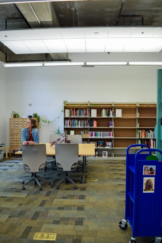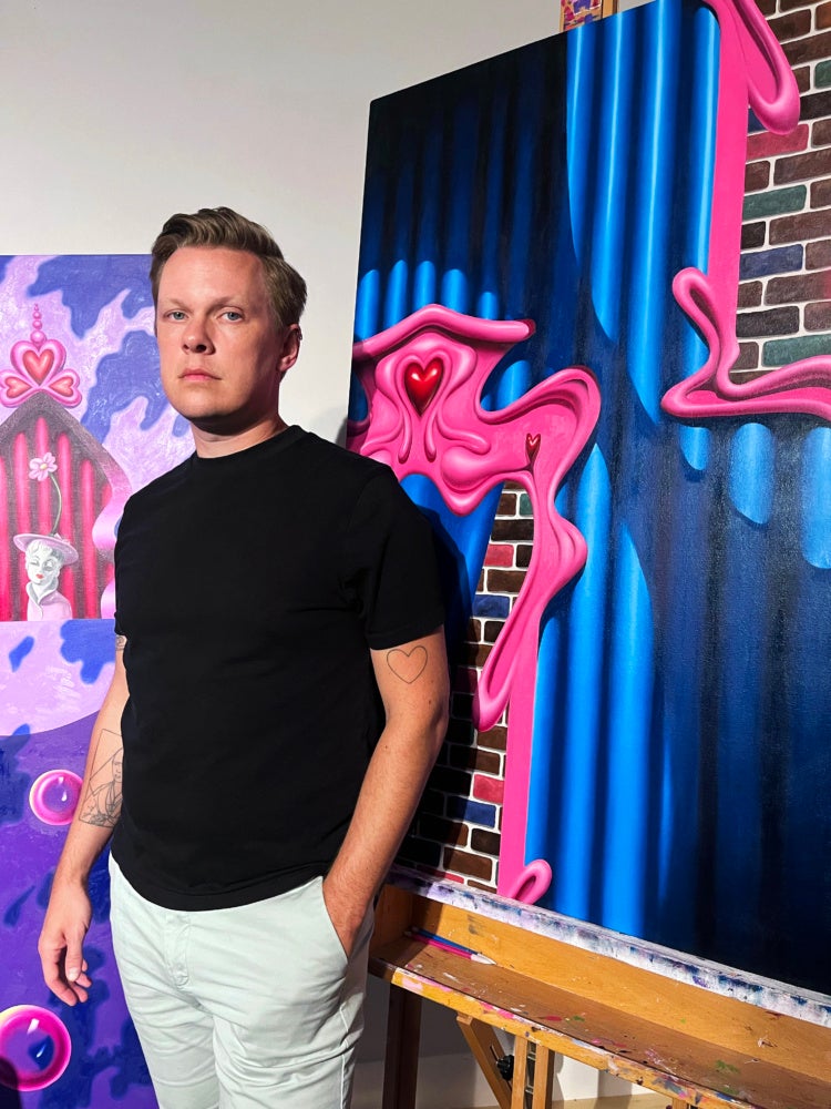
Ben Tollefson’s carriage house apartment and home studio, sits on the edge of Baldwin Park in Savannah. The walls are adorned with art collected from artists he has worked with as a gallerist, curator, and practicing artist himself over the years. The space is a soothing deep shade of violet, and his plants and ceramic cat collection are adjacent to a lemon tree peeking in his studio window. The window sill is adorned with a very charming, very real, feline named Gonk.
Tollefson’s work is enchanting. His playfulness engages light, color, and shape, which intertwines with a technical proficiency. Upon closer inspection, the vibrant paintings depict space in which gravity and the laws of physical space don’t apply. Sometimes the work feels devious and joyful, bordering on menacing.
This interview was edited for length and clarity.
Heather C. MacRae: Starting with the visual motifs that you often focus on and feature in your work, specifically the concept of gender and gender as performance, how do you use visual representations or references to gender and gender performative structures in your paintings?
Ben Tollefson: The aesthetic of gender came into my work a couple years ago when I was thinking about painting as a very serious medium and thinking about legacies of Modernism and the masculine in painting, the idea that painting as a very serious endeavor. I wanted to investigate why that was, and dismantle those ideas a little. The idea of frivolity became important in the work; it manifested itself in very curvilinear forms, things that were excessively Rococo in a way. I included curvaceous and sumptuous forms, often referencing the body, even if I wasn’t depicting the body. The idea of frivolity was closely related to themes of femininity, and I wanted to lean into the idea of the feminine in the work. To investigate why those were associated with gender and why they were forbidden for men or relegated to women or even to gay men.
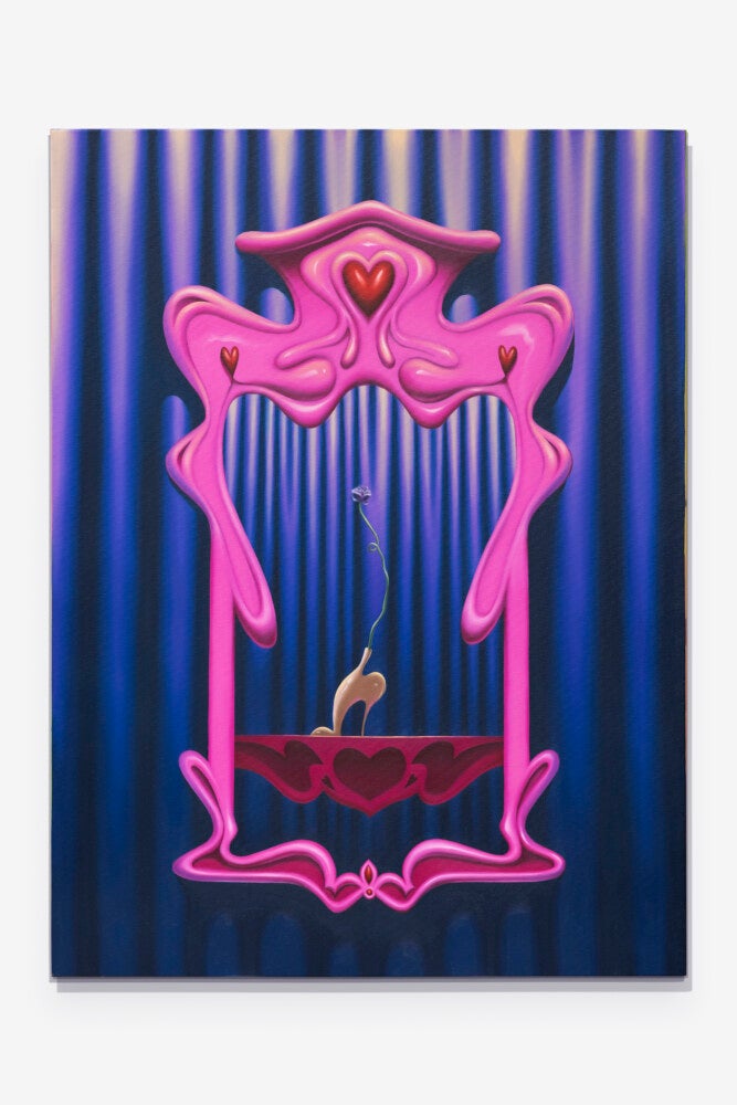
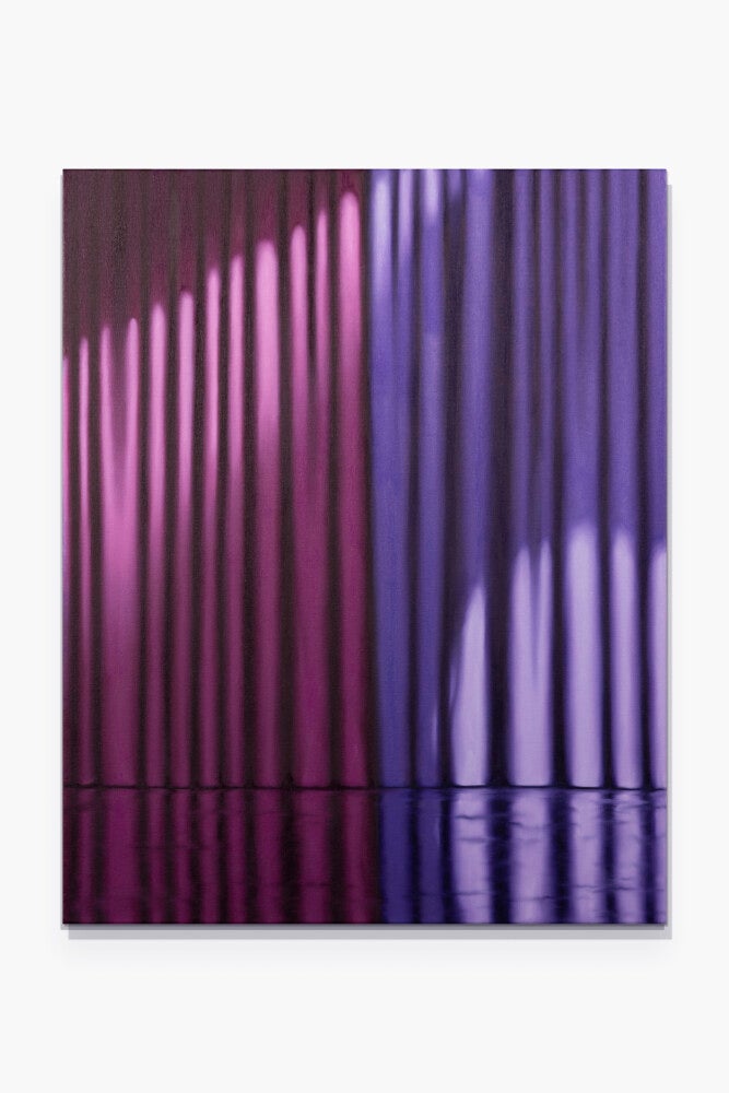
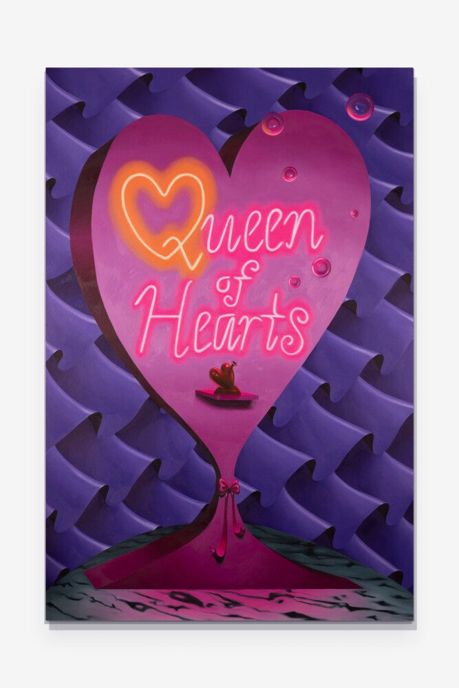
For the last year I have been basing the aesthetics of my work on those ideas. Specifically a scene from a film that I really love and that was really influential to me as a kid and where I first encountered queer space. In the 1976 movie The Pink Panther Strikes Again the main character goes to this queer bar called “The Queen of Hearts”. The set design was so over the top. It has this heart motif that was very Art Nouveau. The visual language from that film is in the paintings, though not always directly appropriated; sometimes there is direct appropriation, like in the pink framing. There is the idea of gendered space and gendered painting is a very important theme in my work as well as things that are coded as performative. Similarly, I have been painting a lot of curtains lately, curtains have so much to do with performative spaces.
HCM: Gender as performance and thinking about what elements maybe symbolize or reference a gendered space or identity, I feel like that ties into the concept of Drag and gender as performance. Drag is something you’ve considered in your work previously, correct?
BT: Totally. I think previously it has really manifested as the idea of artifice or illusion, something beyond. Like with curtains, this one painting started as a very formal painting, it began as the observation of just line, color, and light but then went beyond those ideas to be about the anticipation of what is behind the curtain, which is very related to drag and artifice, stage and theater.
HCM:I love the correlation between stage as a theater experience versus stage as our daily performance of gender identity.
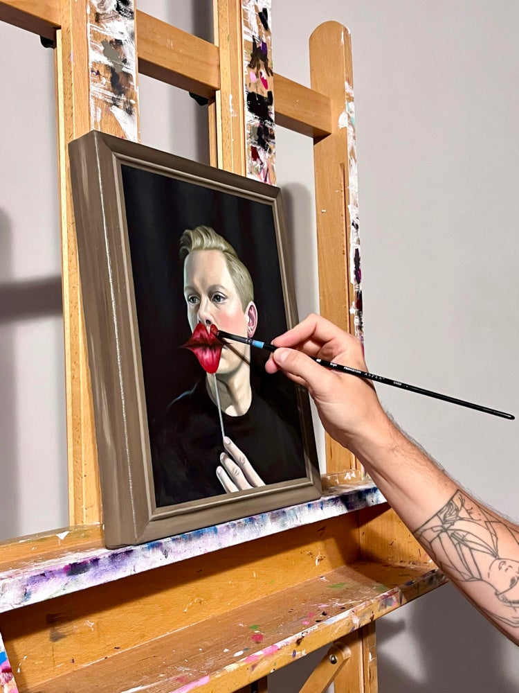
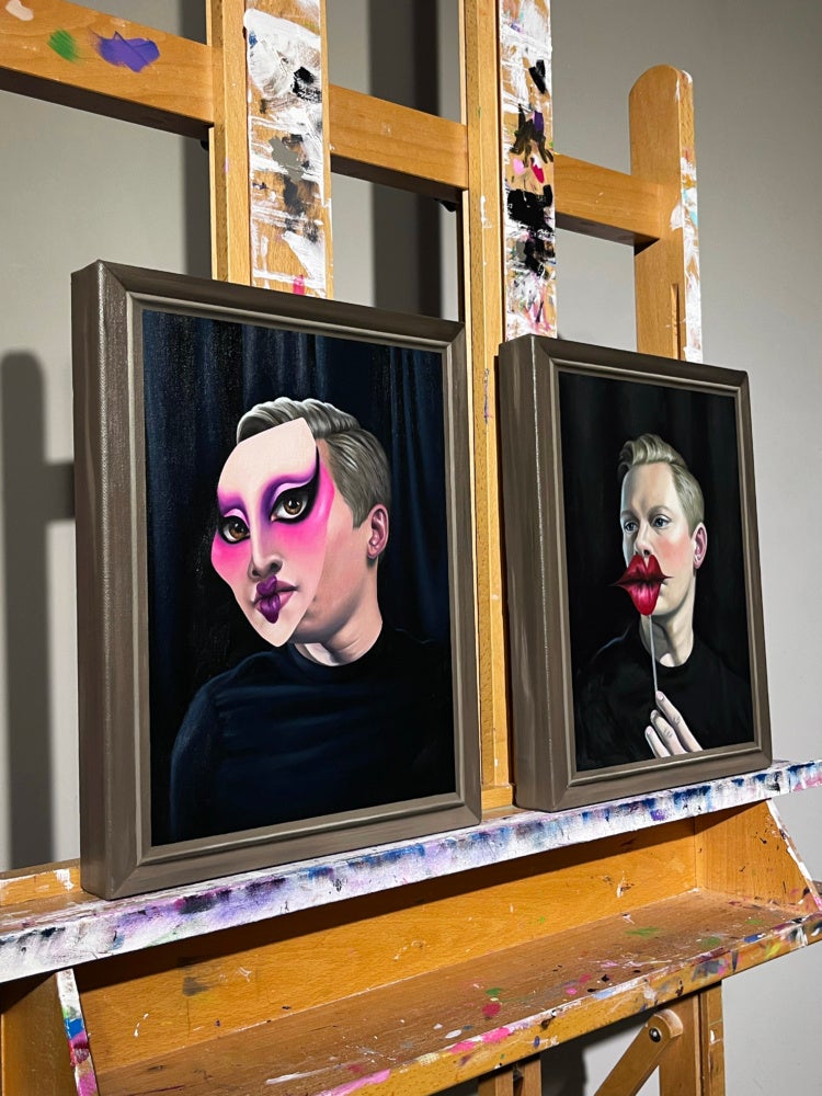
BT: I think that is a very direct segue into the most recent paintings because I hadn’t been really painting the figure directly and now I am really interested in getting back to that. These self-portraits, I have been drawing these masks and then making images of myself with the masks on, thinking of them as figures populating these performance spaces, which I think relates very much psychologically to the daily performance of identity.
HCM: There’s this playful juxtaposition between hard-edged flattening of space where the painting is coming to terms with its reality of being a painting, pushed right up against this very tight detailed depiction of texture creating the illusion of form and depth.
BT: I was going back to Hans Memling and northern renaissance paintings. They are so seductive in the way they depict the sitter but really mess with your perception and the painted space as a window that you could reach into. The mask on the face of the subject becomes like a sticker that is on the painting rather than a mask that is on the face. Conceptually I think this relates to the artifice of identity, like putting something on and taking something off and how that can be very casual or that can be very arduous in a way.
HCM: With identity, often there is a need to recognize the audience and switch between spaces, to know what’s considered appropriate. That’s part of the social construct or social obligation of knowing what personality or part of your personality is allowed in what context. I think that is visually depicted so successfully in these works, that kind of code-switching between painting for the sake of painting and realistic depiction, especially in these self-portraits with the masks. Are you thinking about exhibiting these masks alone? They’re all so meticulously detailed.
BT: These are also fun because they don’t take that long, in comparison to the paintings. And it is nice to be so direct with color, where in the paintings I really layer up color. You can see here where this is the one from this painting, so you can see how I change the saturation, I make some little adjustments from the mask itself.
HCM: The scale variation is interesting as well with exploration of the environment on a larger scale and then to these really intimate pieces in the self-portraits that pull the viewer in so you have this experience of physically moving back and forth between them.
BT: Yea, I think of these larger works as things you can step into. And with this one I was thinking of as a poster for the Queen of Hearts Club so that’s where the brick motif started to come in. That too messes with space, because I am not depicting it as if it were a real poster, it’s not that graphic, it has variations and gradations. That also relates to me the idea of theater, having very shallow space that may appear to have a lot of depth. The gradation behind a lot of these forms came from me looking at old game shows where they would have backdrops with no horizon behind the contestants. It looked like space just went on forever because of how they would use curved lines in the back of the set.
