The exhibition “Coloring,” featuring works by Bill Adams, Paul Stephen Benjamin, Rutherford Chang, Anne Lindberg, and Kate Shepherd, begins inspirationally, as one is magnetically drawn to an electric-green string installation in a far corner. This is after you have been curiously greeted by a neon sign beaming “We Buy White Albums” in the front window of the Atlanta Contemporary Art Center (ACAC), where the show is on view through March 8.
The work of Lindberg, who is based in Kansas City, the 31-foot-long installation Taut Green consists of yellow and green thread stretched between two adjacent walls. Its lemon-lime presence beckons viewers to come close. While the curatorial notes on the ACAC’s website draw connections to the color experiments of Joseph Albers, Robert Irwin, and James Turrell, the most obvious association is the work of Gabriel Dawe, whose show “Light Paradox” was on view last year at the Savannah College of Art and Design’s Gutstein Gallery. His brilliant and colorful twisted string forms required the same sort of bodily interaction and phenomenological curiosity. In his guided tour of the show on January 23, ACAC artistic director Stuart Horodner said that Lindberg’s work inspired the curatorial theme of the show. It was a good place to start.
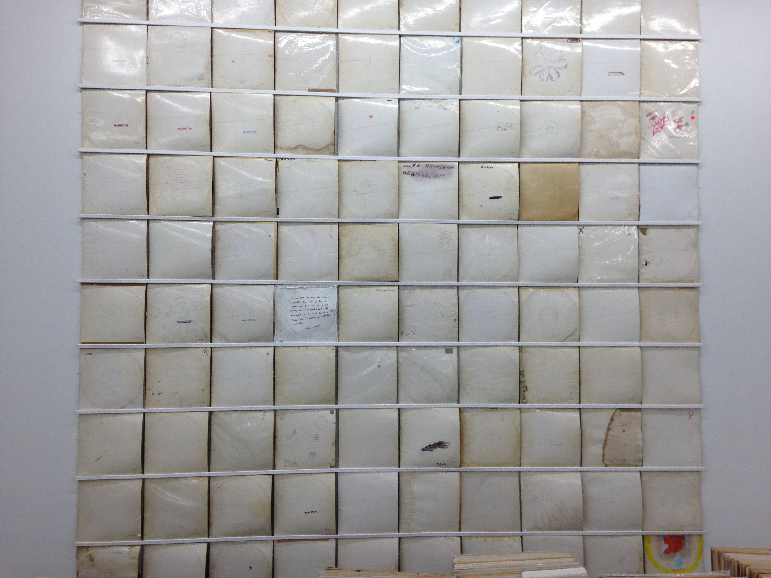
While Lindberg offers the embodiment of the color green, Rutherford Chang is the buyer of white albums. His work We Buy White Albums initially appeared in early 2013 at Recess, a gallery in New York City, where he lives. He currently owns 918 first edition copies of the Beatles’ White Album, and they are all there for your perusal. It’s astonishing to see the array of physical specimens. Some are written on, others drawn on, and the coloring can vary from near white to dirty brown.
British Pop artist Richard Hamilton designed the deliberately plain cover, which was a 180-degree turn from the busy cover of the band’s previous outing, Sgt. Pepper’s Lonely Hearts Club Band. Hamilton knowingly brought minimalism and conceptualism into rock-and-roll discourse, creating millions of blank canvases in the process. Approximately three million numbered copies of the album were printed with serial numbers—another Hamilton idea—in the United States before the record company EMI discontinued that practice in 1970.
The second phase of Chang’s project was to take the first 100 White albums he acquired and combine them into a single consolidated track. The dense sound of the needle simultaneously digging into 100 grooves is chilling—Back in the USSR, indeed. Dear Prudence takes on an echoey layering. Glass Onion is at times a challenging cacophony. The artwork for the double album takes the same approach, a brilliant amalgamation of the 100 covers. The Apple Records logo label from the center of each record received the same treatment.
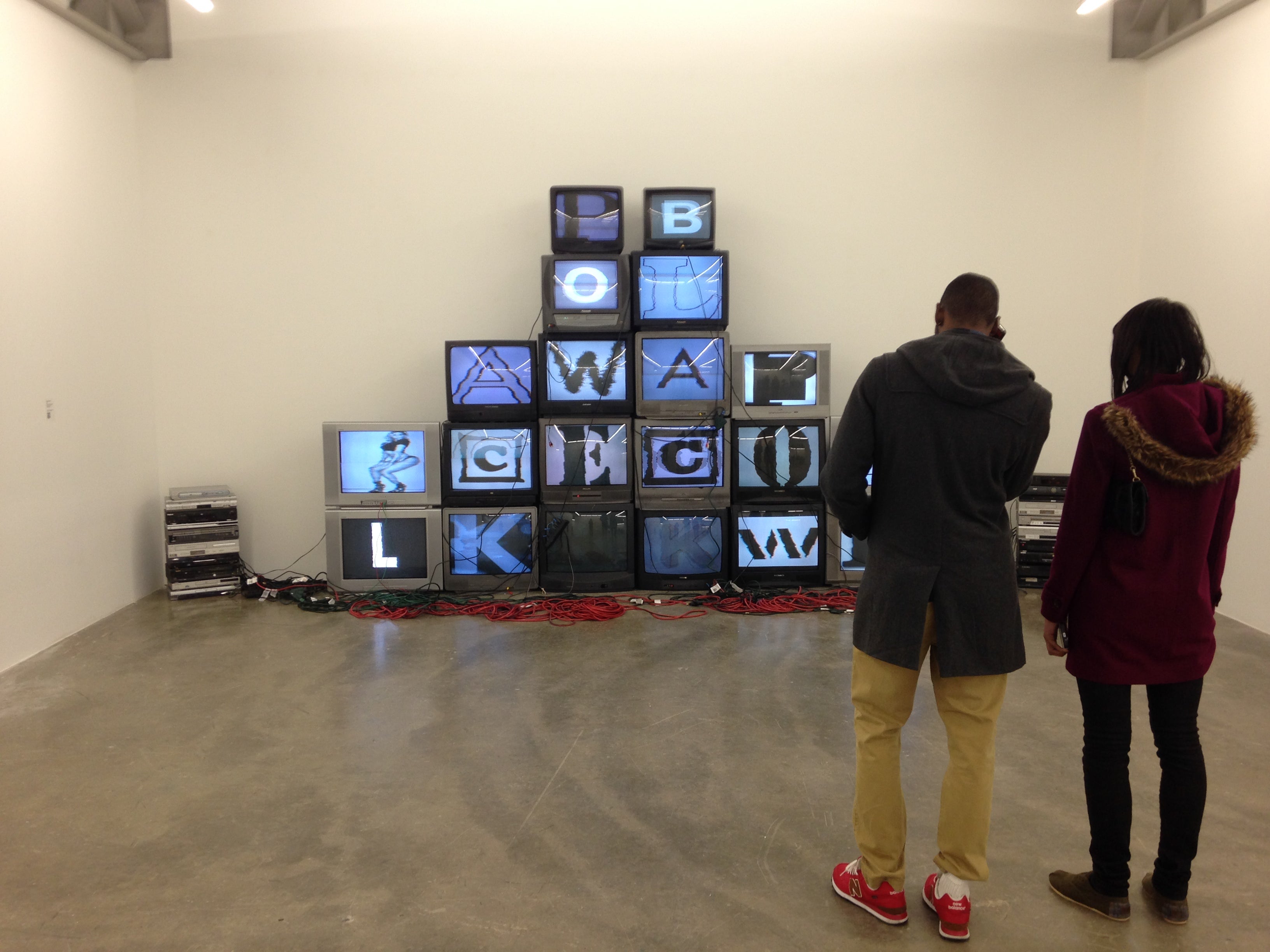
Smartly installed opposite of Chang’s piece is Paul Stephen Benjamin’s installation ABCKL, a stack of old-school television sets that twice spell out “BLACK POWER” on TV screens that toggle between oversized block letters and images of African American athletic and cultural icons (everyone from MLK to Beyoncé and LeBron James). The implication is that “black” identity has been defined and shaped by these pulsating images of our collective cultural conscious and ethnographic experience.
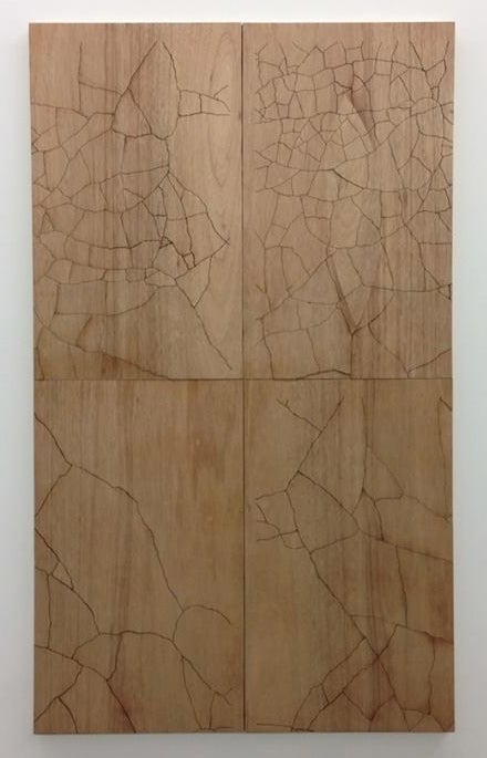
Four plywood panel works by New York artist Kate Shepherd invite scrutiny, if only for their apparent banality. Like the sculptures of Minimalist giants John McCracken and Anne Truitt, the elegance of her artwork lies in its simplicity. The piece Wood is a formal and conceptual tour-de-force. While the inkling that it’s made of wood is quickly confirmed, cracks on its surface require a closer look. Unlike her previous architecture-like renderings on painted wood, she has stripped this work of color and replaced the hard-edged line drawing with laser etching that makes the surface appear to be cracking like dry desert clay that thirsts for rain, adding an element of abstraction to the minimalist surface. Foliage and Light, her other two works in the show add subtle color to the wood but are similarly cracked with laser precision. Shepherd’s work is the intellectual soul of this show.
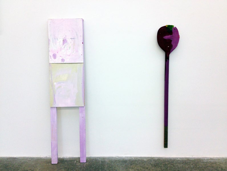
Bill Adams, who lives and works in New York City, produces quirky mixed-media constructions on wooden legs that lean against the wall like miniature Franz West sculptures. Once again, a simple aesthetic leaves one marveling at the construction of these near monochrome forms. And it’s then that I wonder, what of the curatorial theme? The Lindberg installation captures the essence of color, while Shepherd offers up one of her least colorful works in recent memory. Chang’s is not about color so much as popular culture, and Benjamin’s is more about culturally constructed identity.
Color resonates here on multiple levels, sometimes playfully, as with Lindberg’s installation, sometimes subtly as with Chang’s and Shepherd’s. Despite the seemingly thin curatorial premise, the rigor of the selected works offers an intellectual pursuit that satisfies.
Carl Rojas is a new contributor to BURNAWAY’s visual arts community. A reformed punk rocker, he encourages all to go the ACAC to see the art and form their own opinions. (He remains very happily married to the editor of BURNAWAY.)