charcoal, cut paper, acrylic, oil, caulking on raw canvas, 60 by 46 inches.
Seeing Austin Eddy’s solo exhibition “someone to ride the river with” is a bit like watching a schoolyard brawl. Or rather, it would be like witnessing Philip Guston pin Pablo Picasso’s arms behind him while Carroll Dunham punched him in the gut. Despite his statements to the contrary, Eddy’s show is a slugfest of art historical references, arch comments, sly winks and puns, and as much insider knowledge as you would need at any patrons’ event. That isn’t necessarily a bad thing, but what results is a series of works that are always in danger of being lost in the reference. Case in point is for you i’ll be a little more flexible. Obviously, Eddy plays with the art historical at precisely the same time that he is telling us how unimportant it all is. So this painting is filled with visual clues that could reference other significant art and artists. That pipe? Magritte. The guitar? Picasso, or Braque perhaps? Gris? Maybe that is precisely the point, so all the paintings begin with the possibility that they will double in upon themselves, or call another artist out. Perhaps this is who Eddy is riding the river with.
None of this should matter, but the problem is that much of this overlay hides what is some quite subtle technique and some incredibly delicate moments that Eddy is actually constructing within and across his canvases. Hidden within the humor is precisely the loss and loneliness that he speaks of in his statement, but much of it is simply brushed off in favor of the laugh fest and the art historical references that cause one to speed by.
Some of Eddy’s strongest elements are found in his handling of materials. In misery and gin, which opens the exhibition, there is a collaged element in the mid-lower right where two pieces of paper collide in a moment of incredible tension. That split really does rupture the entire work. The drinking glasses in the work are incredibly evocative as well, from the olive in the martini in the upper right to the black oblivion of the tumbler that anchors the lower left.
Another highlight is the near monochrome i’ve got your back, a creamy, yellowish, white and raw canvas work where the distinctions between surface and ground literally fade into nothing, and you are left with a pair of silhouettes that practically sing with tension. In fact, it is often in the pop of light against the raw canvas, as is highlighted in the challenges with “seeing” here, or the lusciousness that he brings to his deep blacks that the subtleties of the paintings really come to the fore.
So “someone to ride the river with” becomes a pop take on a historicist drunken ennui, a lonely tale, a black-and-white film noir homage to bars and drinks and sad songs seen through the lens of cutouts and graphic novels. Somehow the language of Cubism and Surrealism don’t sit comfortably here. The largesse of these styles is always already pushing any subject into the extreme, exaggerating its emotions, making it seem that if it could talk it would speak in hyperboles, or if it could have an emotion it would usually be hysteria. Arguably, this isn’t the language Eddy wants to speak or the emotion he wants to convey. Deep in his works is a sense of taut lines, complex tensions, and deep emotions. I hope he has a laugh, tells Guston and Dunham to let Picasso go, and moves on to what he really wants to say.
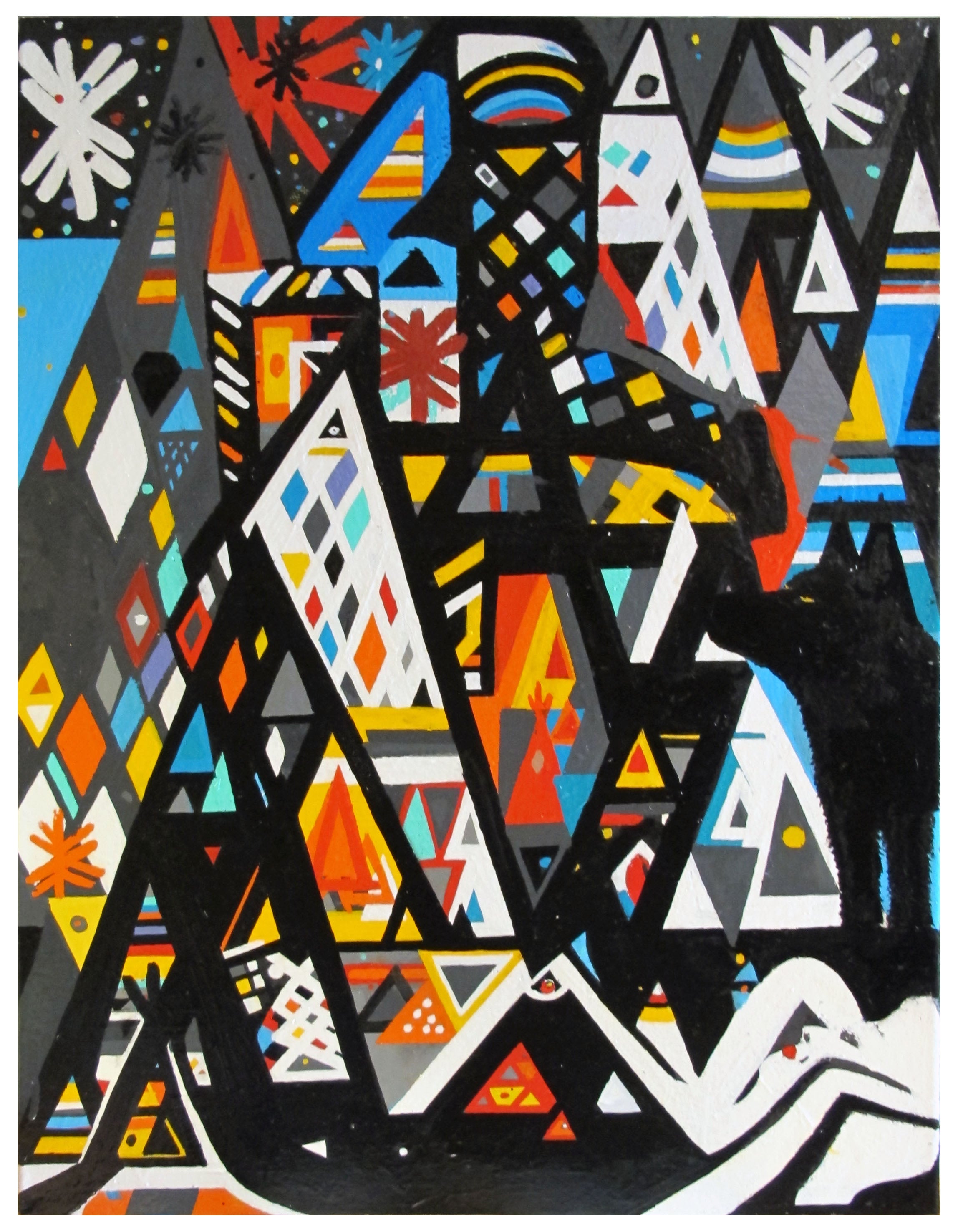
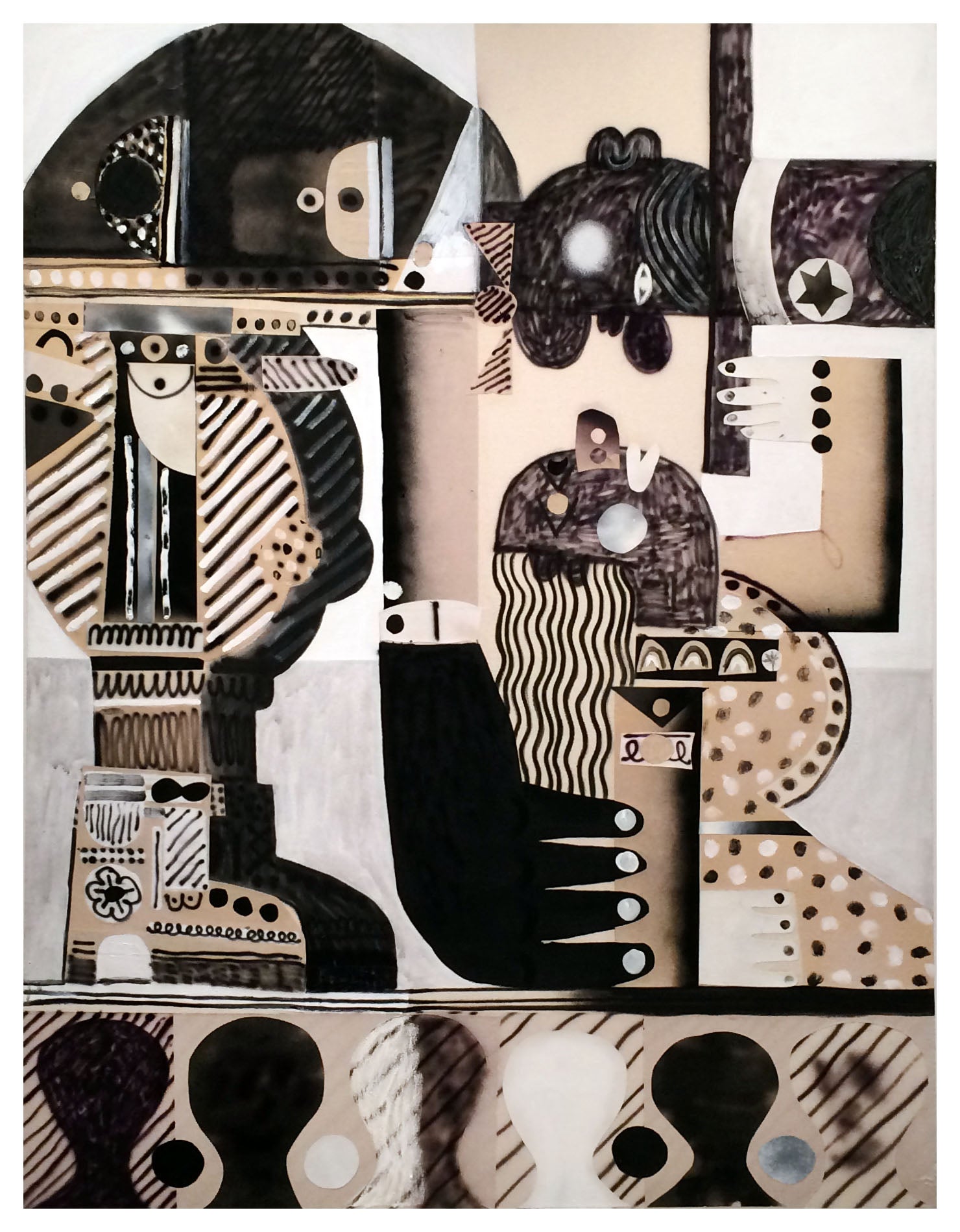
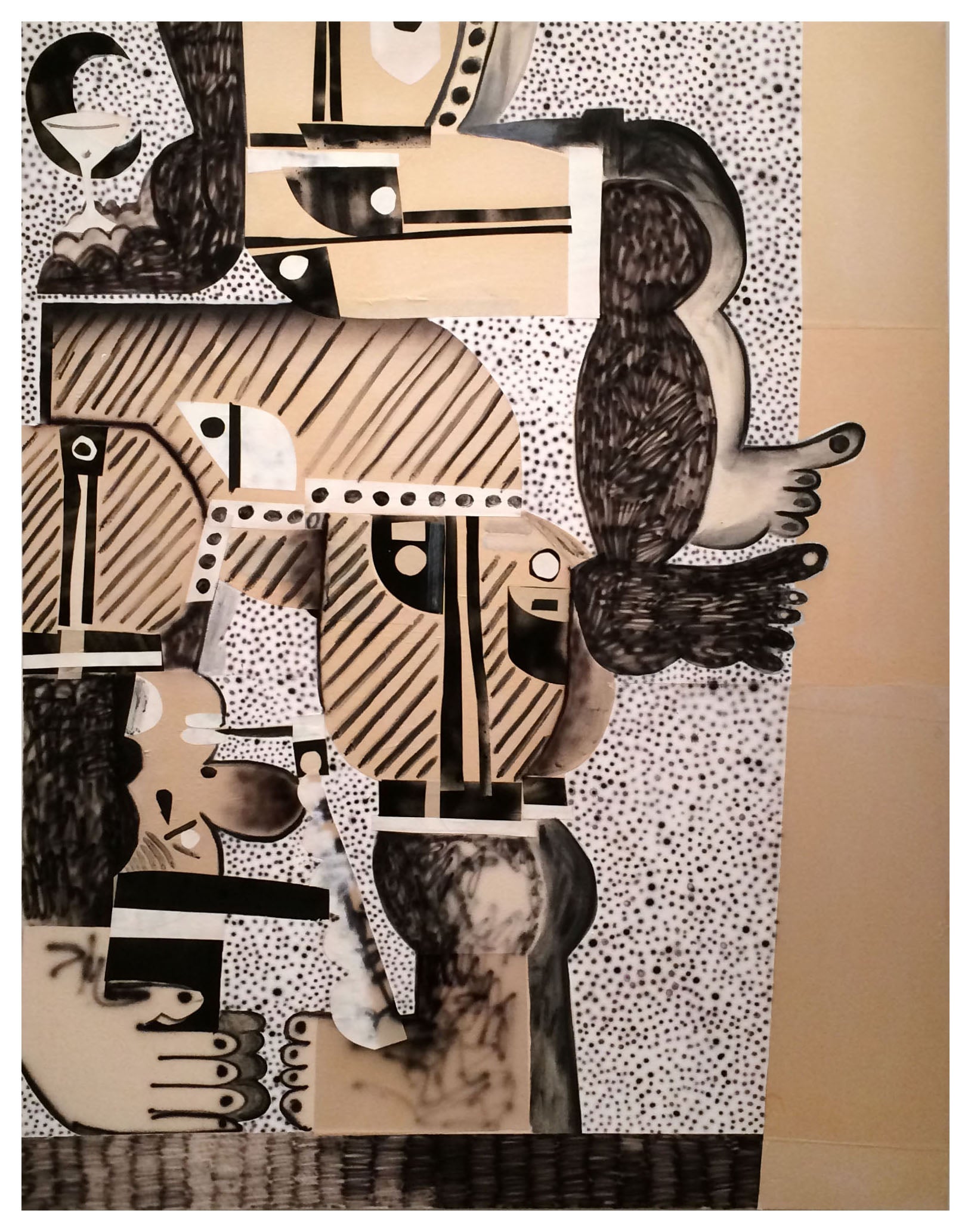
Harrison Keys’s “Always Aweigh,” his third solo exhibition with the gallery, continues his fascination with constructing a hybrid of advertising, art history, graphic novels, design, and pop culture. At first glance, his references seem strongly rooted in the ’60s and ’70s, which they are, but Keys also has a nuanced understanding of the present day evidenced by the almost sing-along repetition of “Snoop Snoop” and “Dre Dre” in Grey Eyes. The work is one of six small ink on paper pieces, which are gems of information, dense with imagery yet open and airy.
Keys uses composition like a graphic novelist, and the works feel as if they could have been pulled from the pages of the Fabulous Furry Freak Brothers or Fat Freddy’s Cat. He reinforces this sexy and transgressive feeling through the boobs and booze of February 26 and a backside with a pop of color anchoring the top left of Intake—the full suggestiveness of which will simply be left to the viewers’, and readers’, imaginations, although it looks as though someone may literally be backing that ass up.
One challenge Keys faces is reconciling the frivolity of the works on paper with the darkness of the oil on panel pieces. The larger works almost feel rooted in a different time with entirely different intentions and influences. Rather than being filled with sexed-out and doped-up comic heroes and ballers, Keys’s large paintings are like journeys into unhappy midcentury holiday scenes. In Needsy, for example, the heaviness of the hand reaching for the cigarette and the martini glass is not offset by the whimsical patterning of the tights, despite their visual repetition and joy.
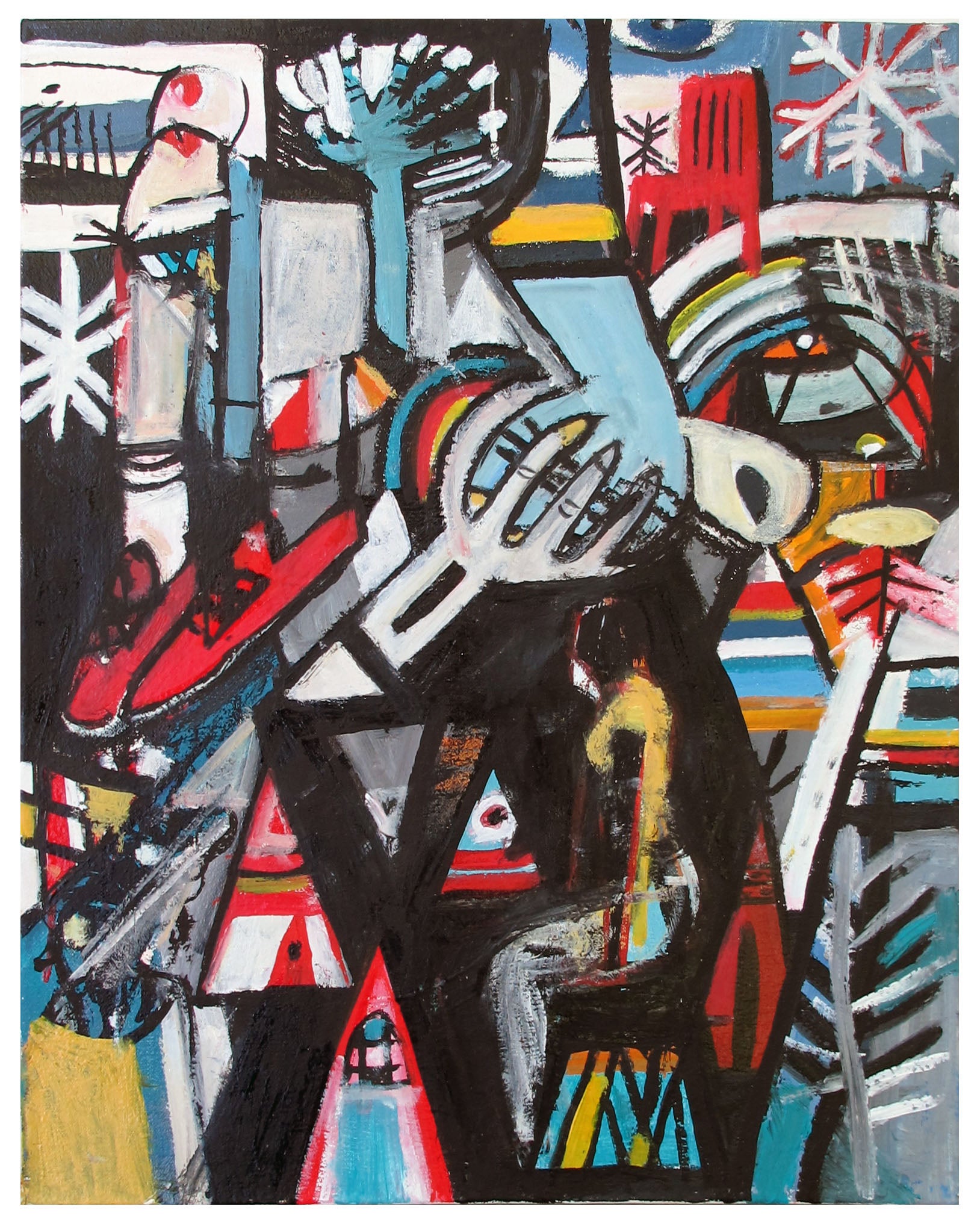
2014; oil on panel, 20 by 16 inches.
This tendency to take viewers back becomes almost immersive, however, at the same time that it becomes unbearable. In the oil on panel works, it is as if Keys is in fact considering and depicting issues that are more complex, or at least he is rendering them in a more linear, narrative fashion. One of the challenges with using a heavy, dark outline in early 21st-century painting is that this style of handling of materials is always already reminiscent of Max Beckmann. Other references also appear, fleetingly, from Basquiat to Stuart Davis, moving in and out of view. Keys uses these tropes to give viewers a sense of familiarity, which can in fact be a dangerous thing.
Encountering the works on paper in the middle of the exhibition is like stopping for a breath. Their white grounds create moments of respite from the sheer blackness of the paintings. There, it is not even like Keys is painting shadows, it is simply as if everything that is not color has literally caved in. Here, since you can stay afloat a little longer, the drawings continue to reveal themselves, hiding figures like John Lennon, who seems to have just fallen off the cover of Yellow Submarine to gaze at a nude in the corner.
For viewers, the biggest challenge is reconciling the loose, playful sketchlike drawings with the dark, almost historicist paintings. What ties them together is Keys’s iconography—the flat pyramids and mosaic colorings that appear in the tights of Needsy and again in Sorry. Keys plays with his ideas in a range of media to explore the ways they work, much in the way a musician explores a phrase to learn where it fits best in a solo.
Filled with wit and whimsy, and underpinned by what can only be termed a truly dark sense of humor, Keys’ show is an exercise in visual pleasure. For those with an art historical tendency, there is material aplenty. Those who also love snapback caps, rollin’ on chrome, Snoop and Dre, will see that far from being historicist, Keys leaves a smart record of contemporary culture drawn across the page.
Both exhibitions are on view at Get This Gallery through July 12.
Brett Levine is a writer and curator based in Birmingham.