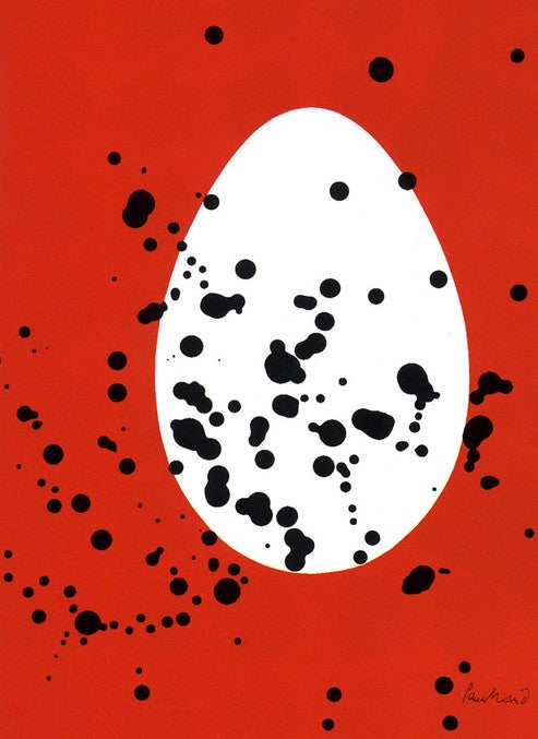
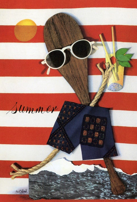
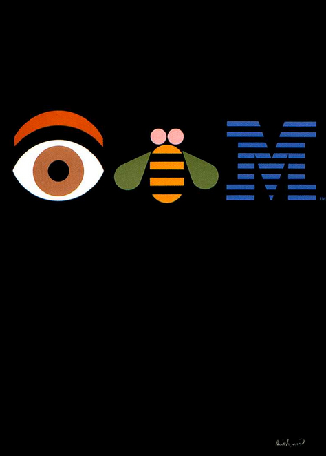
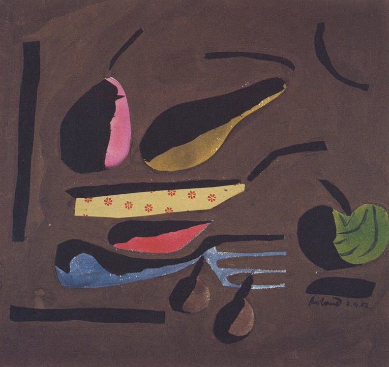
Wade Thompson, founder and creative director of the global brand design firm, Son & Sons finds inspiration in Paul Rand (August 15, 1914-November 26, 1996), who many refer to as the “godfather of American Modernism.” Rand, the subject of a recent exhibition at the Museum of Design Atlanta, was an American graphic designer and art director, most well known for his corporate logo designs, such as those for heavyweights IBM, UPS, Westinghouse, and ABC. Rand was a natural at public relations and extremely influenced by art early on. He set the bar for graphic design and advertising in the 20th century. His definition of design is that “design equals the synthesis of form and content,” his sometimes simple solutions being the most powerful statements out there. The works of such artists as Pablo Picasso, Paul Klee, and Alexander Calder, among others, were a great source of inspiration for Rand. The spirit of playfulness, the strength behind minimalism, the fine art found in typography, and a new idea of what the designer could achieve for a business overall, also struck him. He was also a prolific writer, and some of his quotes were included in the exhibition.
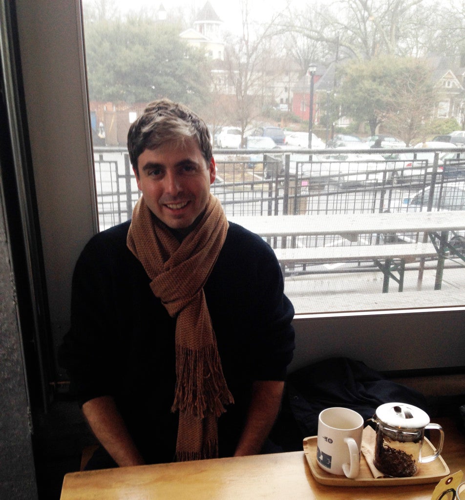
I recently met with Thompson to discuss what led him away from the world of philosophy to the very different terrain of design. Thompson manages to incorporate a great deal of philosophical supports in forming and maintaining the backbone of his company. Here’s an example from the Son & Sons website: “Believe in jump ropes, silly putty and the power of waffles and dreams. Polish the peculiar, purge the expected and ambush the ordinary.” Thompson believes in a model for the current office environment that involves his employees staying physically active to help cultivate creative ideas and for general well-being and happiness. This can range from golf to rock climbing. Thompson talked about how Rand has affected his work, his company, and the design world as a whole. We also discussed some past Son & Sons projects and an exciting one in the works in Marfa, Texas.
Sherri Caudell: What first interested you in design?
Wade Thompson: I was always drawing things and ended up getting into design through art. I was studying philosophy and would walk by the art and design school and see this stuff on the walls. I didn’t understand how rich the concept of design was: the role that inspiration played, that the study of typography was involved, or that there was a whole practice around it. I thought, “Okay, your Uncle opens a store, he gets you to draw something and that’s the logo.” I had art shows at places like Aurora Coffee, Saltworks Gallery, and Youngblood Gallery. A lot of my drawings were ad-inspired and really graphic. I always liked looking at one object. I’d draw “a pen,” “a coffee cup,” “a shoe,” or “a person,” instead of the whole environment.
SC: So simplicity is important in the way you approach art and design?
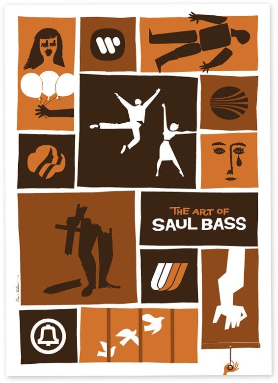
WT: I learned to draw bold, clean lines by reading Tintin comics. I decided to attend Portfolio Center for graphic design and fell in love with all of these old designers’ work; Rand is just one. There’s also the typographer Wolfgang Weingart and American graphic designer Saul Bass. There’s a richness in their visual vocabulary that we don’t have now because data and images are cheap.
SC: Do you feel that images have lost their power?
WT: There’s so much eye candy. We have a poverty of beautiful, genuine images. Hopefully, designers show an image that resonates with you. That’s why when you see a body of work by Paul Rand you can really appreciate it, because until seeing that, you don’t realize you’ve been hungry for so long. It’s meaningful, significant work and I think that’s what we all aim to do as designers.
SC: At Son & Son’s, how do you approach making work that is “significant”?
WT: We have a three-part methodology called Truth, Beauty, and Impact. There’s something genuinely unique about a person, a brand, an organization or a new bottle of wine. The Truth is about ascertaining what that is. The Beauty phase is about using the craft of design to make the Truth manifest, so that you can feel and see it.
SC: How do you think Rand influenced graphic design?
WT: Rand was able to sit at the table with chiefs of some of the world’s largest corporations. One of the things Son & Sons talked about in our presentation at MODA is that he represents these dichotomies, or these unresolved contrasts. On the one hand, he played with finger paint and cut stuff with scissors. But he also had the ability to march into a boardroom and convince a senior leader to value that work and demonstrate why it would help propel the company toward its desired destination. He’s helped us present our work in a way that corporate leaders can understand. When I talk about design with my clients; I’m not talking about typography or color. Your doctor wouldn’t say, “Hey, which scalpel should I use for this surgery?” Many designers talk about those details, but I think it’s the wrong conversation for that level of client. Rand showed that design and a business’s success could be inextricably linked. A corporate identity done right is a point of value for a company, not just a point of cost.
SC: What projects has Son & Sons been working on lately?
WT: We just created a new identity for the Buckminster Fuller Institute. It was an unpaid job, so we had to figure out how to do it, and we worked with some great Portfolio Center students to create the identity. We also work with big companies like Coca-Cola and Disney. We recently created a new identity for Midtown, where we live and work. It’s fun to do something that you have to see every day.
SC: Rand considered design to be a form of fine art. Do you agree?
WT: There’s an art to it, but the terms aren’t interchangeable. It’s a different pressure than an artist in the studio making work. There’s this rigor to it. You have to ping-pong between your ability to go into this child-like part of yourself—where you’re free, open, and creative—and your ability to link to a strategy with a budget and a timeline. Designers are more “meaning makers” in that they practice a creative discipline and are then able to synthesize a lot of elements to produce a meaning. We have so many rules that we follow and make for ourselves with typography and page layouts. I think what designers do best is connecting these gadgets, services, and products.
SC: How do you go about choosing a new designer?
WT: They’ve got to have that multifaceted ability, like Rand possessed. He brought together the businessman, the child, the artist, the craftsman—all of these forces into one. He was also a kind of cultural historian. How do you look into the world and then play that back to a company so that it knows what it’s asking for? There’s an innate ability to arrange graphic elements and to make things beautiful and compelling. It’s beyond just what an artist can do.
SC: You have to be an artist with a business mind. Do all of your designers talk to the clients?
WT: Yes, I want my designers to have well-rounded careers, where they can walk into a room with executives and stand up, voice their ideas, talk about what their work means for the company. Having a “voice” is essential and that’s what Rand ultimately had.
SC: Designers are always looking at things—we all are—but it’s your job to pay attention. What has been inspiring your current vision for Son & Sons?
WT: If I had a theme for this year, it would be “rock ‘n’ roll.” It’s the spirit of the old tube amplifiers, plugging in your guitar, or just hitting the drums and jamming. You plug in and there’s grit and it’s not over-produced. It’s about being really true, lo-fi, and having strong, simple ideas. There’s an authenticity that people are hungry for and they’re tired of things that are over-shellacked.

SC: What developments do you see in the future of graphic design?
WT: I think there will be a genuine clamor to reexamine classic typography, which you already see in Europe. There’s a rhythm of positive and negative space; there’s so much strength in those letters. In the States it seems more superficial and stylized, but I hope that we get a real renaissance and understanding of the bones of typography. There are some terrific typographers here in the States that are already doing it.
SC: Who are two typographers that you would recommend someone look at?
WT: Two I really look to are Swiss typeface and graphic designer Max Bill and Dutch designer Karel Martens.
SC: Can you talk a little about the futuristic drive-in project that Son & Sons is creating the brand identity design for in Marfa, Texas?

WT: Ballroom Marfa aims to produce projects that couldn’t necessarily happen in a museum or gallery. They are interested in the community, so whenever they have an opening, they invite the entire town. There was an old drive-in in Marfa, which was a spot frequented by residents. Ballroom Marfa worked with the architecture firm MOS from New York, which is run by Michael Meredith and Hilary Sample, and they’ve designed a beautiful, faceted, metal structure. It works like a band shell and a drive-in movie theater, and it affects the desert terrain around it. Joshua Siegel, associate curator of film at the Museum of Modern art, is curating the opening weekend of the project. Visual artist Leo Villareal will be creating several on-site works at the park. The drive-in will also include community programming, such as county fairs, baseball games, and a morning gospel choir. It should be completed this year.
SC: Do you agree with the following quote by Paul Rand: “Don’t try to be original; just try to be good.”
WT: Yes, if you look at the pile of wood in front of you that you’ve got to chop, and you’re really trying to do a good job, your style and a beautiful solution emerge.
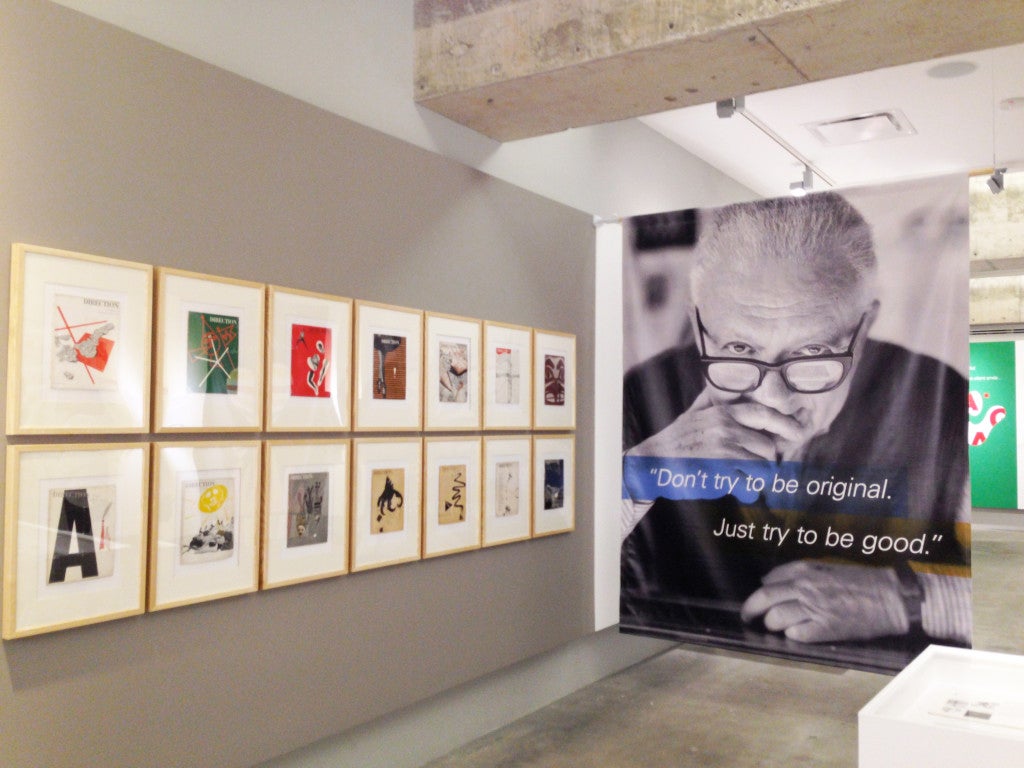
SC: What has the Museum of Design Atlanta been contributing to our city?
WT: We sponsored the Rand exhibition and they’ve come to us and said, “What would you guys want out of an institution like this?” In New York, you don’t have the design museum coming to you saying “Hey little fella, how can we make this better?” I want us to use it as a place where people come together to talk about and experience design, not just a museum with a bunch of artifacts on the wall.
“Paul Rand: Defining Design” appeared at the Museum of Design Atlanta, October 27, 2013-January 30, 2014.


