The vigorous, highly saturated paintings in “Pinkney Herbert: Tower of Noise,” on view at Sandler Hudson Gallery through July 28, fall somewhere in the lineage of Abstract Expressionism, but they do not accept the authority of the mark or gesture as absolute. Layers of uncertainty and seemingly incidental spaces playfully undermine any modernist posturing in these complex non-objective works. The execution of these paintings is relatively straightforward, but they manage to be full of surprises.
The 18 works on view range from 16 inches to 5 feet on a side. The all feature digital prints that have been cut into shapes, adhered to panels and painted over. The prints often appear to be digitally manipulated photos of paintings themselves. Others might be photos of specific subjects, altered to become indistinct. Herbert applies sinuous wandering lines that range in width from approximately a quarter of an inch to 3 inches. Solid shapes, repeated scrawls and other marks exist in a varied and intense color range, with neutrals and off-whites also coming into play. Herbert is attuned to the language of liquid application. Some of his paint is noticeably fluid and semi-transparent, while some is stiff enough to show the striations of the brush that spread it. Occasional heaps of paint stand up at the end of a stroke where the brush has been lifted.
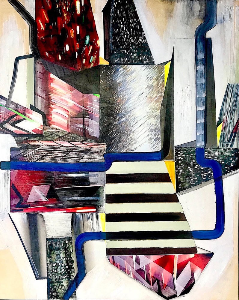
The artist divides his time between Memphis and New York City, and the works in this show have titles that refer to New York. Long Island City is a painting composed of asymmetrically stacked prints cut into rectilinear and trapezoidal shapes. We can see the order of application in Herbert’s process, and in this case, a tan and white application on the panel functions as a background space with the prints and painted marks applied over it. The prints contain various patterns—blurred sparks, arcing white slashes, horizontal black and greenish-white stripes. Long blue and black lines move like racetracks around and across these forms. Herbert’s level of restraint with the printing is just right. Since we don’t know enough to classify what they are, they meld into the painted language rather than separate out.
Whether the paintings are small or large, the forms within them do not change in size. At the larger size, lines and gestural marks are embraceable by viewers, not towering over or attempting to overwhelm us. The larger works contain a greater number of forms, which introduces tempo and rhythm to the compositions through sequence and repetition. Smaller paintings like Vernon Avenue 1 or East River Series 11, for example, are simple and concise like a haiku poem. Tower of Noise, on the other hand, is busy and filled with sprawling improvisations.
My own gut reaction is to classify these paintings as totally non-objective, but there are numerous hints— the titles being one—that Herbert might be taking real subjects and abstracting them rather than making the paintings without any visual reference. If there are real pictorial subjects in there somewhere, Herbert has placed them far out of our reach.
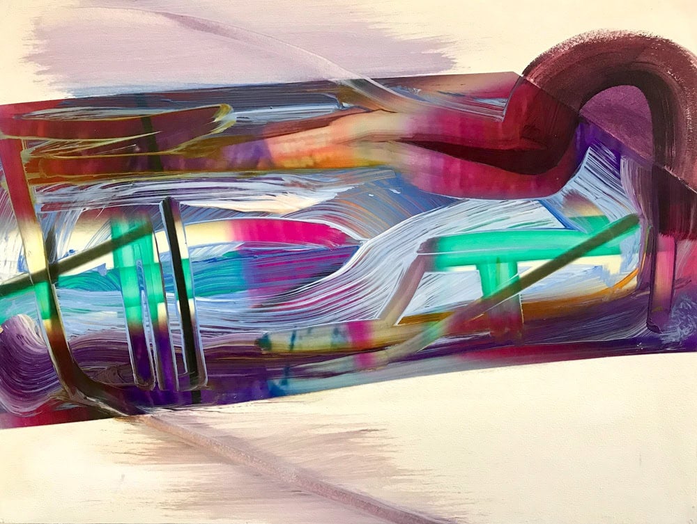
East River Series 11 is one of the few horizontally oriented pieces in the show. A print moves across the panel, occupying the majority of it and tilting up on the right. The edges are not quite straight lines—they shift gradually as they ascend, framing softened magenta, orange and violet shapes. Syrupy strokes of white, blue, and neutral paint have been scrawled over the whole. Many of the marks are actually signs of removal, where Herbert used some kind of tool (maybe a stiff empty brush) to trawl through the paint to reveal the print beneath it.
In classic Abstract Expressionist painting, gesture and action were adamantly straightforward, to a point of being doctrinal. Jackson Pollock was consistent and firmly intentional with his drips, as was Franz Kline with his black lines. Herbert’s lines are dubious: they are self-doubting, they play tricks, they lie. Has the mark been applied or wiped off? Has it been photographed and printed? Is the print a truthful account, or another kind of fabrication? These questions are there if we want to ponder them, but we can move past them into pure visual experience as well. Herbert enjoys adding things together, creating complications and ambiguity. Along the way, he strips action painting of its heroic stature and gains latitude to contradict himself as he sees fit. His works are not reductive; they are almost maximal. There is search for beauty and an unabashed enjoyment of color.
Herbert is acutely aware of the history of non-representational painting and he manages to elude familiar classifications, creating an improvisational space for himself and for whoever cares to join him.