Charlie Watts’s The Throwaways Project, at Emory Visual Arts Gallery
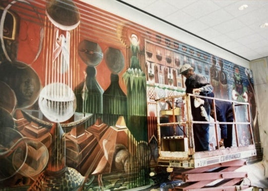
Spending time within the dark, cool walls of Charlie Watts’s current exhibition, The ThrowAways Project: A Photographic Exploration of Sex Trafficking , is not advisable for anyone who counts finding answers and resolution as a necessary part of the art viewing experience [Emory Visual Arts Gallery, June 20-July 25, 2013].
There are no answers here. Watts created lightbox photo collages [duratrans backlit film] to illuminate the little known—but shockingly real—world of sex slavery in Atlanta. There are questions about this concern: How is this happening here? How is it not getting more attention? How do we possibly talk about anything else until this has been fixed? The layered images themselves refuse to resolve peacefully, forcing the viewer to eventually accept the discomfort. It’s impossible to not want to look at the photos, yet they’re unfixable. The work itself is undeniably lovely. The dreamy quality of the pieces somewhat dims the urgency put forth by Watts’s artist statement, but maybe that’s okay.
To be fair, what is the “correct” way for a visual artist to approach a topic like this? For a decidedly heavy subject, the show does the best anyone probably could do: Through imagery, it approaches the line of romanticizing the issue without crossing it, but also without going too far in the opposite direction towards exploiting the victims for the benefit of the artist, or the catharsis of the audience. Watts isn’t relying on the stark emotive potential of the subject itself to alleviate the burden to actually make good art. The ThrowAways has an appropriately emotional impact, as opposed to solely a manipulative one. There is a justified confusion in finding a way to visually represent this issue and the artist’s feelings about it. Quietly adjacent to the show itself is literature from advocacy groups, and QR codes that provide additional info on the reality behind the work, both of which round out a surprisingly elegant handling of an issue that most artists probably would’ve tripped on.
-Jessica Blankenship

Matt Relkin & Andrew Prieto at Beep Beep Gallery
Everything that’s great, awkward, and funny about Matt Relkin and Andrew Prieto’s current exhibition at Beep Beep Gallery can be found not only in the work itself, but also in their artist statements [June 22-July 27, 2013].
Brooklyn-based Matt Relkin’s statement unceremoniously and unpretentiously tells viewers that the last few years have been busy; he hasn’t had much time for making art, which allowed him to appreciate his practice more. His pieces in the show aren’t meant to be inroads to deep intellectual and spiritual understanding; they are simply the products of his stolen moments with art making over the last few years, and he correctly asserts that these moments, in and of themselves, are worth celebrating. There’s a deliberate sidestepping of any cohesive conceptual themes that would give more weight to the work. This approach only makes it easier to appreciate Relkin’s work. The meticulously clean acrylic paintings reuse his go-to elements: monoliths transplanted in wide-open plainscapes, mingling with natural, celestial, and geometric components. Relkin successfully masters medium and form via easy manipulation of perspective, composition and especially color.
Andrew Prieto’s paintings, aside from their brightness, show little tangible relationship to Relkin’s pieces. This would be fine if the proximity of the two didn’t make Prieto’s work look comparably sloppy and superficial, which, can be great if they aren’t trying to take themselves too seriously. And then we get to Andrew Prieto’s artist statement:
“I am interested in hybridization as a social, psychological, and political tool. The process of re-imagining what is understood to be concrete, static, or truth brings me great joy. Working to activate observations of our history, culture, and psychology in a graphic way, allows an open ended-ness that begs for questioning.”
Forcing that many buzzwords into one paragraph, and to serve as a summarizing statement for work that outwardly shows no trace of embodying any of this, leads me to immediately think that this statement is meant to be humorous. Matt Relkin’s statement says “these are just paintings, let’s not church it up” in a straightforward way, and Andrew Prieto is possibly saying the same thing by satirizing the overly-academic significance that so many artists attempt to bestow on their work through use of rhetoric. If I choose to believe that Andrew Prieto’s artist statement is a joke, there’s nothing not to love about this show. It’s two guys having a fun time with vivid, energetic paintings.
Actually, even if Prieto isn’t kidding, this show is still hilariously perfect; one guy being super laid back about his immaculate paintings, and one guy being laughably heavy-handed about paintings that seem completely devoid of the depth and significance he attributes them.
-Jessica Blankenship

Et in Arcadia ego at {Poem 88}
“Even in Arcadia, I am [there],” as the title of {Poem 88}’s current show, Et in Arcadia ego, translates, captures the presence of death even in paradise [June 1-July 27, 2013]. The three artists on display—Allyson Ross, Sean Abrahams and Ted Fair—embody the tension between the beauty of an almost fantastic paradise and the inevitable destruction that results from the human gaze with their work. Each artist tackles this timeless conflict through their own distinct media: The glowing paper structures of Allyson Ross line the elevated space to the left of the gallery/bookstore, Sean Abrahams uses colorful works of pencil on paper to depict almost cartoonlike landscapes, and Ted Fair captures his surroundings in a wall-length series of haunting untitled photographs.
The arrangement of the show in the gallery’s space in the Westside Arts District stunts the dialogue between the works of the three artists. They read as spatially disconnected, which unfortunately makes it difficult for the viewer to form visual and thematic connections. However, the intensely emotional evocation of Fair’s photographs, and the tension of fun and sinister in Abrahams’s drawings make the show worth a stop.
-Alix Taylor
House rules for commenting:
1. Please use a full first name. We do not support hiding behind anonymity.
2. All comments on BURNAWAY are moderated. Please be patient—we’ll do our best to keep up, but sometimes it may take us a bit to get to all of them.
3. BURNAWAY reserves the right to refuse or reject comments.
4. We support critically engaged arguments (both positive and negative), but please don’t be a jerk, ok? Comments should never be personally offensive in nature.