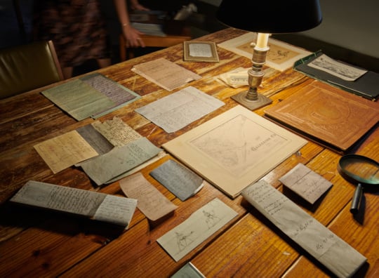
Sharon Shapiro’s shimmering watercolor paintings are the type that you’ve seen a lot of. For her exhibition “Strawberry Letter23,” at {Poem 88} through August 9, the Virginia artist mines images from vintage sources like magazine ads and film stills. She mixes these with personal images, faces, and domestic scenes into a seamless personal iteration of the diverse and hypersexualized advertising and culture industry of the last half century. Like artist John Currin or Richard Prince, Shapiro neatly and remorselessly folds appropriated imagery into her own vision with nary a complication.
Most of Shapiro’s figures are placed on the empty grounds of large leaves of paper, though the smaller works on view are painted to the edges and on panel. It’s hard to discern her impetus for the work beyond the retro references of the culture and visual process that bore them out. They are like weathervanes that indicate which way the terrible wind of imagination isn’t blowing.
Shapiro’s earlier work looked more restless, more indicative of a struggle. The artist pastiched images from diverse sources, combined in an imaginative but forced way. Animal faces overlap portrayals of women, marked by the newer work’s same underlying sense of simmering angst. The overt sensuality that comes out in the later work is underplayed. Some works are rendered on canvas with background imagery. However more inventive, they lack the verve of the aqueous media, but haven’t solidified into the archetypes that she portrays now.
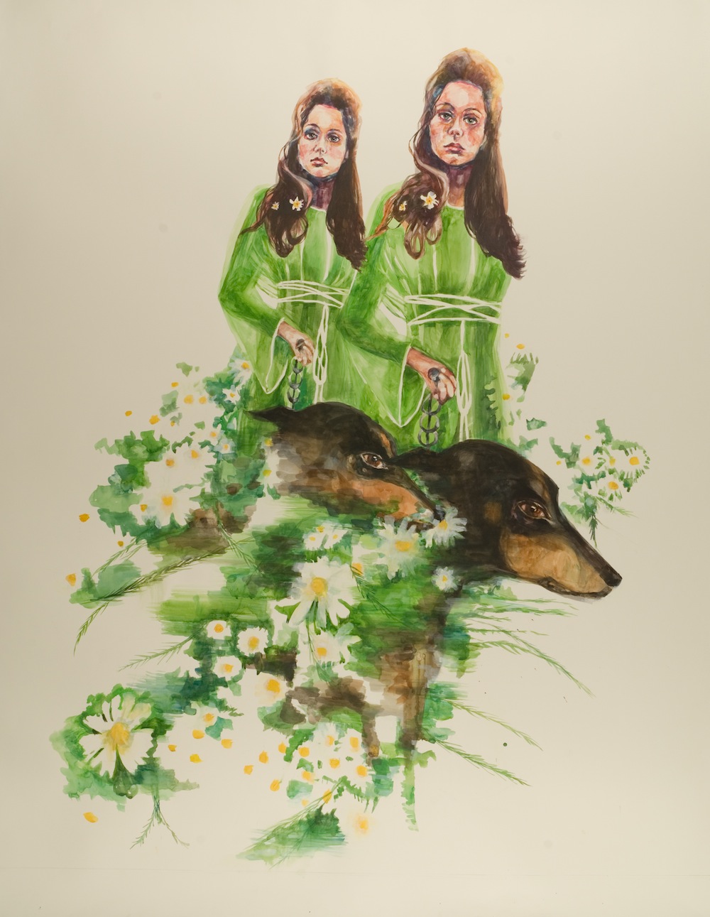
That is not to say that the current paintings aren’t exquisitely crafted, carefully considered, or beautifully articulated. Shapiro’s woman are ethereal. They tend to be elongated, and the expertly painted quality of the skin is delicate. Daisy Chain is especially arresting. Pushing out of a blank ground, two women, twins leading Dobermans, stare blankly toward the picture plane, as if through the viewer. Their dresses melt into a flowery cloud of greenery that loosely enshrouds the dogs. The hazy treatment lends an air of movement, maybe of memory, even as the women appear inert. Perhaps a trademark of vintage ads, the faces are specific. The women almost scowl. The work speaks to an interest in cinema. The downward energy of the overall composition and of the women’s demeanor disaccords with the dog’s lateral movement, like the contrasting elements represent opposed time sequences.

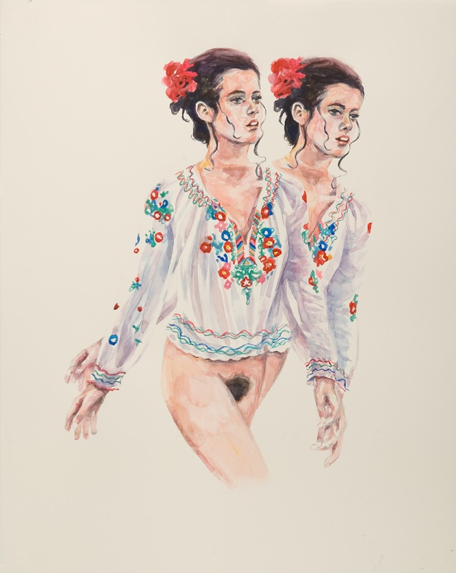
Field Day is also spare. Its damsel wears an expression that falls between angry and languid. Provocatively, she sports no undergarments and she sprouts a twin from her right side that rotates out of her on a pivot. Both figures have on embroidered see-through shirts and a flower behind the ear. Here, the artist strips away the drama of ambient ornamentation and psychological tone, leaving something behind that is a bit dry and inconclusive. Analogous paintings that round out the series do more of the same. The smallest works of the show more explicitly use photography as a source. Compositions are cropped in accordance with the specifications of a camera. They are less chancy than the large works, and employ a host of ambiguously feminine signifiers. Women talking on the phone figure prominently, as do flowers.
Advertising design of the ’70s and ’80s marked a high point for a viewing public’s threshold for a special blend of realism and camp, which waned due to the disenchanted aesthetic of the ’90s and the proliferation of imaging software that happened into the oughts. As a result, ads from the period have a confounding draw. Specificity of facial features, funny gazes, odd stances, props, and a bevy of indicators mark a different society with slightly different mores and aesthetic tastes. In attempting to depict such qualities, Shapiro recycles an image fabricated by the media. With this show, she tries on culture to see how it feels and, not surprisingly, it feels fine.