There’s something funny about soda’s place in the American imagination: a democratic consumable with its perennial presence in the past century of cultural production. Its quotidian optimism eclipses the less sexy associations of soft drinks: private corporations, plastic bottles, and rotting teeth. Artist Ross Landenberger’s exhibition 5 Mountain Dews at The End comes from a similar observation. Less iconic than its parent company Pepsi’s namesake, Mountain Dew occupies different associations, one of motorbikes and video games rather than romance and subtle pop songs.
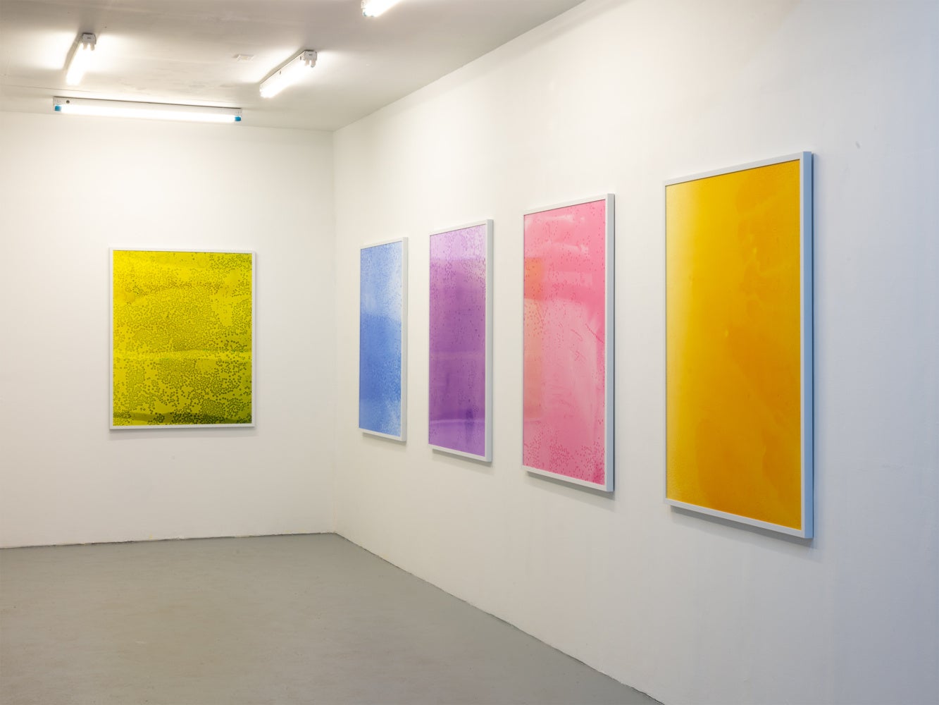
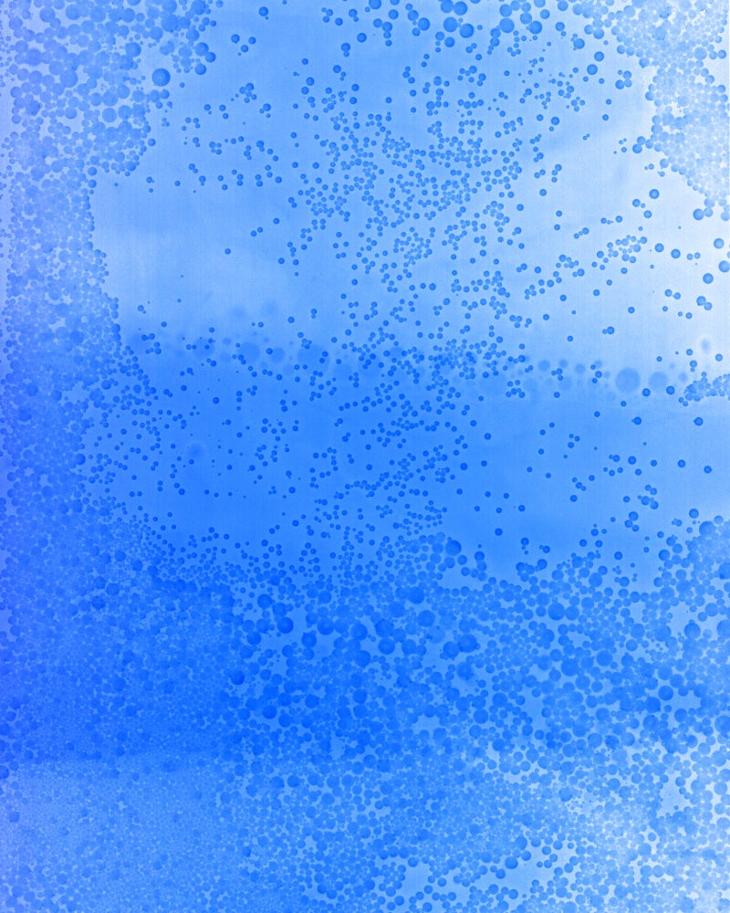
One of Mountain Dew’s appeals is the fluorescent color; a walk to a corner store reveals a spectrum of hues displayed in clear plastic bottles and aluminum cans. Landenberger’s process emphasizes the formal qualities of this corner store experience, removing the frivolous marketing and reducing the drink to pure color. The works render the soda through cameraless exposures in a darkroom, placing large format color film in a tray of Mountain Dew and then setting off a brief exposure of light while submerged. The resulting images are effervescent color fields, printed fifty inches tall to reveal subtle variations in value and carbonation.
The experience is not unlike minimalist post-war painting, capturing similar vibrating frequencies as Ellsworth Kelly or Mark Rothko. What is interesting in this comparison is the difference in materials, specifically the pigments of painting and photography. Painter Amy Sillman describes the painting studio as a “haphazard chemistry lab,” the extractions of variably noxious color, dye, and substance pushed around in studios from the beginning of time to the present.[1] Landenberger identifies a paradox when applying this observation to photography: though his means of capture are still toxic C-41 film processes, the color captured on film is an index of how it appears to the eye. His colors decidedly come from Mountain Dew, a product whose primary purpose is consumption. To drink a liter of deep blue Mountain Dew Voltage Raspberry is a very different experience from drinking a liter of cobalt blue paint.
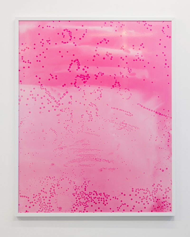
Stepping back, the emphasis on color and the serial arrangement resemble a makeshift Gay Pride flag, the first iteration of which is attributed to artist Gilbert Baker. Baker assigned each color a specific meaning, meanings which still linger as the flag becomes a larger palimpsest for contemporary LGBTQ+ discourse. In the original design, pink represented sex; Landenberger’s pink represents Mountain Dew Major Melon. I like the contradiction presented by Landenberger in reclaiming the soda through a queer sensibility, and that this involves removing it from its fraternal feedback loop and presenting it as an isolated substance.
Pink was soon removed from the original Pride Flag due to a shortage of manufactured pink fabric, with indigo and turquoise later combined into a singular blue stripe. The individual meanings of colors fluctuated before eventually becoming moot, adapting to the material constraints of fabric availability. The relationship between consumption and expression is the ultimate paradox of the show, informing each other in an irregular oscillation. Seemingly fundamental and hormonal qualities, like sexual attraction or gender expression, often manifest as objects and purchases before ultimately being assigned deeper meaning through lived experience. One may call this repeated process of assignment, art.

[1] Sillman, Amy, “On Color” in the book Amy Sillman Faux Pas: Selected Writings and Drawings (expanded edition) ed. Charlotte Houette, François Lancien-Guilberteau, & Benjamin Thorel (After 8 Books, Paris), p. 60.
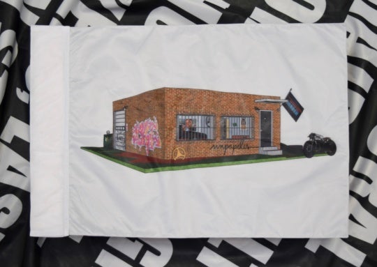
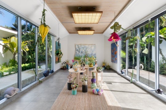
5 Mountain Dews is on view at THE END Project Space in Atlanta, Georgia through December 6, 2025.