Three exhibitions at Hathaway Gallery, closing May 31, raise a longstanding issue of interpretation that remains, sometimes, an object of contention. “Easy Air” is a three-artist show of works by Ridley Howard, Scott Ingram, and Christina A. West; “Painter” is a series of paintings by Craig Drennen, and Tyler Beard’s “Shoreline” is a multimedia installation.
The century-old aesthetic question is: Can there be (or, rather, should there be) a truly private visual symbolism, accessible only through verbal explanation by the artist? Historically, public symbols were often put to private practices in art; historians of the Renaissance quarrel endlessly over what this or that artist did with the emblems of Renaissance Hermetism or the less arcane allegories of the Counter-Reformation. In practice, symbolism in much contemporary visual art consists of a negotiated imprecision, in which the audience knows the rules of the game enough to try to make sense of a body of freshly invented emblems that the artist may not comprehend very clearly either.

Newly anointed Guggenheim Fellow Craig Drennen has contextualized his “Painter” series lucidly, and acknowledged that by basing his successive series on the characters in Shakespeare’s least-known play “Timon of Athens,” which he describes as “a corrupted text… [with] a dubious relationship to the respected canon,” he has gained the freedom to create a set of interlocking private symbols “in the manner of William Blake or Matthew Barney.” T. S. Eliot’s attack on Blake for attempting a private symbolism has been the essay most often cited to illustrate the traditionally minded critic’s failure to grasp the meaning of personal vision. Contrary to Eliot’s supposition, Blake’s symbolism makes sense as an internally consistent system once you understand enough of it. So does Barney’s (I think).
The challenge lies in getting a large enough sample, plus enough time, to get the viewer’s perspective aligned with the artist’s. I continue to have difficulty lining up the multiple possible meanings of Drennen’s repeated symbols in these paintings (but that may be his point): each canvas features a variation on a large, gestural “X”; repetitive elements are trompe l’oeil Polaroid photographs, depicted as if taped to the canvas with only its white border and black backing visible, and cigarette butts, close to trompe l’oeil but a bit less dimensional than the painted Polaroid. The X is a symbol with so many possible meanings over the centuries that I cannot possibly begin to elucidate them here; from St. Andrew’s Cross to the “any means necessary” of Malcolm X, from the gestural marks of Abstract Expressionism to the quickly rendered X mark on a house to signify “no disaster victims in here,” X remains the unknown quantity in more ways than we might think. A photorealist rendering of a photograph in which the means of chemical reproduction is visible but the image isn’t, plus the stereotypical cigarette butts that cluttered the floor of painters before the surgeon general’s cancer report changed habits for a few generations—here, again, the possible meanings of the symbols branch off in several directions.

This tendency to symbolic multiplicity defeats me utterly when it comes to “Easy Air,” starting with the title. The gallery tells us it’s “a nod to spatial designation and division,” but so far I haven’t found the technical term to which it presumably refers. The ordinary-language term, in which doing something with an easy air means “in an offhand but well-practiced manner,” may imply that we shouldn’t take this show as seriously as its setup suggests. Maybe the jokes aren’t meant to add up, and we should just admire how the artists make effort-laden effects look effortless.
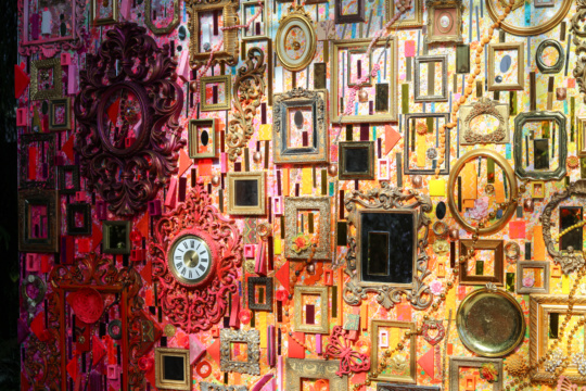
The problem with this is that so much about the show suggests that the jokes are loaded, or aren’t jokes at all. Ridley Howard’s meticulously drawn facial portraits of heterosexual couples kissing or lone women reclining are typically accompanied by geometric shapes rendered in vivid colors, suggesting a whole history of 20th-century art in which you could have geometry or you could have intimate drawings of persons, but not both together. Something similar goes for Scott Ingram’s subversions of serious abstraction by rendering its historical forms in construction materials, as if the whole painting/assemblage were an accidental aspect of a half-completed wall. His rendition in wood of an I-beam piercing a succession of walls—an allusion to an earlier site-specific piece shown in a photograph elsewhere in the exhibition—subverts Gordon Matta-Clark’s seriousness without being funny; given its size, the piece dominates the gallery space and sets the tone of things set off balance that is doubled and redoubled in the architectural surroundings of Christina West’s sculptures.

I am left with the feeling that Lacanian critics would have a field day with the myriad mirrors in which West’s mostly naked figures are reflected but never study their own faces or awkward postures. The one partly clothed figure, an otherwise naked man pulling a T-shirt over his head, faces away from the mirror in which he couldn’t see himself at that particular moment in any case. In another instance, a woman peers through the slats of Venetian blinds at her double mirroring her posture on the other side of the blinds; the twinned figures are reflected in the mirror on the wall behind them, a mirror in which the viewer also is likely to be reflected. And in the most spectacular architectural intervention, a wall filled with mirrors of various shapes also contains window openings through which the viewer can gaze at an anguished-looking male nude on the floor, once again facing away from the mirror that reflects him. Alternately, viewers can look up to see their own reflections in a mirror in a framed cutout that further confuses perception.
We have come a long way from the confident (but also jokey) “Nuda Veritas” of Vienna 1900, Gustav Klimt’s painting in which a desirable naked woman held up the mirror of truth to the supposedly unwilling viewer. West’s figures seem disinclined to look, to the point in one particularly comic example of a man inserting his face into the wall like the proverbial ostrich. This may be the only laugh-out-loud moment in an otherwise disconcerting body of work depicting bodies that are designed to be maximally unattractive without being repellent.
All of this definitely “explores the psychology of constructed space and its relationship to the human figure,” as the gallery statement puts it. But it remains an exploration so filled with possible interpretations that after numerous visits I still haven’t quite gotten my head around it, or in it. More is going on than I can find symbol systems with which to fit it together, but the clues don’t suggest that the show is meant to defeat all such attempts at tidying up the conceptual landscape.

The conceptual and literal landscape is what Tyler Beard’s “Shorelines” is all about—or is it? Beard’s own statement describes his work in terms of “a soothing formalism,” but there is more to a series of identical marble bas-reliefs of abstracted ocean waves bears titles that refer to sites from Capri to the Galapagos. At the very least, a whole history of tropes about the ocean is being brought into play, or maybe just a wry joke about landscapes in which the spectacular variety of the land contrasts with the identical nature of the water. Most of the sculptures really are as appealingly formal but lacking in obvious meaning as Beard claims they are. Perhaps the overdetermined symbolism of the other two exhibitions leads to an illusory belief that there must be a meaning in the curious arch or doorway that serves as a display case for a whole set of small ceramic objects—it’s a single artwork, titled Passersby, and the shapes seem as loaded with indistinct symbolism as its shelves are with sculptures. Perhaps we should take Beard at his word and stop thinking and just look. These works are so filled with visual pleasure that they don’t need to be inserted into any other story or history.
Jerry Cullum is a freelance curator and critic living in Atlanta. His poems, reviews, and essays have appeared in a wide variety of local and national publications, including Art Papers and Art in America.