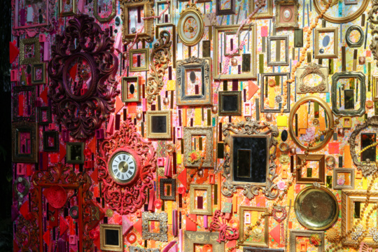
Carol John’s work Striped (2014), a cheerfully nostalgic, ice cream parlor-themed oil painting, is situated at the beginning of her exhibition “I Want Candy” at {Poem 88}. It features eyes, broken combs, cigarette butts, ice cream cones, polka dots, striped straws, striped ropes—“an encyclopedia of her iconography” as gallerist Robin Bernat puts it. The whimsical motifs in this work are the building blocks of John’s art, appearing again and again in her paintings, often in repetition and nearly always in the most vibrant of hues.
What these symbols mean is open to interpretation, and their effect varies based on placement and hue. For example, Roped (2016) is a colorful swirl of striped ropes that overlap one another so frequently that it’s difficult to decipher where each coiling strand begins and where it ends. In Brick 1 and Brick 2 (both 2016), the ropes make another appearance—three small squiggles squeezed into a painting that is dominated by two semi-orderly patterns—brick and scalloped—on a bright pink background.

While Roped seems chaotic and active, Brick 1 and Brick 2 are pleasant and neat—that is, except for the tiny ropes between bricks. It’s as if the ropes represent creativity, whimsy, madness, while the bricks represent rational, orderly thinking.
Rows of oil paintings adorn the far right wall of the gallery—ten on paper and one on canvas demonstrate John’s use of bright colors and repetitive patterns and symbols. In Dude 1 and Dude 2 (both 2005), for example, she’s repeatedly painted the words “dude” and “dud” both right side up and upside down. The upside-down “dud” also looks like the word “pop”—a reference to her Pop art bent (not to mention the bright colors that pop off the paper). The bubbly letters (the kind you draw as a teenager) appear linked together like circuitry, a style that appears in other paintings on this wall.

But perhaps the most attention-grabbing of her recurring icons is the eye. The mesmerizing Eyes-Lips (1997), for example, is made up of numerous, overlapping pale blue eyes looking in all directions. At the top of the painting, the eyes have no pupils; towards the middle, pupils begin to appear, becoming larger and larger towards the bottom of the paper.
Though none of the eyes are attached to a face, their expressions can still be read. Depending on pupil size and direction, an eye may appear eager, frightened, apathetic, or dull. What’s even stranger is that the longer one stares at the painting, the more the pupil-less eyes at the top begin to look like something else—perhaps the tops of people’s heads and shoulders in a crowd. Whether that is intentional optical illusion or individual interpretation, the effect suggests there are many different ways of seeing.

“I Want Candy” is on view at {Poem 88} in Atlanta through December 10.
Amanda Arnold is an Atlanta-based writer and editor whose pieces on travel, lifestyle, food, photography and other topics have appeared in a variety of print and online publications, including Professional Photographer, Rodale’s Organic Life, Forbes.com, Forbes Travel Guide, and HowStuffWorks.